When looking at gene expression data, many people first focus on reproducibility. Do replicate samples under the same condition look similar? Do the points lie along the diagonal in a scatter plot? Is the correlation coefficient high? Reproducibility is, of course, important when evaluating the quality of gene expression data. But if the correlation coefficient is high, can we really say that the data are “good”?
In this article, we use microarray data as an example to examine the relationship among noise, reproducibility, and dynamic range. The important point is not simply to remove noise as if it were meaningless, but to understand where the noise lies and determine from what point the measurements can be treated as reliable signal.
Is Noise Just Unwanted Data?
Imagine measuring the same sample twice with a microarray and comparing the two measurements. Suppose a scatter plot shows large variability in the low-signal region. At first glance, you might think that the data contain too much noise and are therefore of poor quality. However, seeing noise in gene expression data is not itself unusual. It is unlikely that every gene is expressed in a given cell or tissue, and every measurement system has a limited range within which measurements can be made reliably.
Values for genes that are not expressed, or that are expressed close to the detection limit, tend to be unstable even across repeated measurements. Therefore, variability in the low-signal region is actually a natural phenomenon. The problem is not that noise exists. The problem is when the noise becomes difficult to see, making it harder to distinguish the boundary between noise and signal.
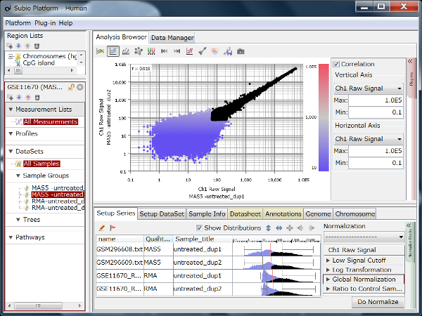
Fig1: An example of Affymetrix HG-U133 Plus 2.0 data processed with MAS5. Considerable variability is visible in the low-signal region at the lower left of the scatter plot.
In this figure, substantial variability is visible in the low-signal region. At first glance, the data may appear to have poor reproducibility. However, rather than indicating a failure of measurement, this variability can be understood as a region containing many genes that are not expressed or are expressed near the detection limit.
Looking at the histogram, the distribution of MAS5 signal values may appear to have a single peak. In practice, however, it is more natural to think of it as a two-component structure in which the noise and signal regions overlap. Not every low signal value represents pure noise; genes with weak but real signals are also mixed into this region. For this reason, the boundary between noise and signal should not be thought of as a single sharp line, but rather as a transition zone.
Does a High Correlation Coefficient Mean Good Data?
Next, let us look at an example in which the same raw data were processed with RMA. In the RMA-processed data, the large variability in the low-signal region is much less visible in the scatter plot. As a result, the data may appear more reproducible and of higher quality than the MAS5-processed data.
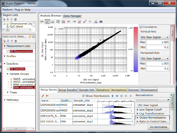
Fig2: The same raw data as in Fig1, processed with RMA. Variability in the low-signal region is much less noticeable in the scatter plot.
Indeed, if we look only at the scatter plot, Fig2 appears cleaner, and the correlation coefficient is also higher than in Fig1. However, a high correlation coefficient does not necessarily mean that the entire dataset is reliable. Evaluating reproducibility using correlation coefficients is mainly meaningful for genes that lie within a reliable signal range. If genes that are not expressed or are close to the detection limit are also included, the correlation coefficient can be strongly influenced by the way the data are represented and by the numerical processing algorithm.
In Fig2, variability in the low-signal region is less visible, but this does not mean that the noise has disappeared. The histogram shows a high peak in the low-value region. This can be interpreted as values from the noise region having been compressed into a narrow range. In other words, the fact that variability is not visible in the scatter plot does not mean that all measurements can be treated as reliable signal. On the contrary, when the noise becomes less visible, it may become more difficult to judge how much of the data should be included in the analysis.
The same issue can arise with normalization methods that force the distributions themselves to become more similar. Even if the post-normalization distributions look neatly aligned, this does not necessarily mean that only technical variability has been removed. Biological differences among samples may also be reduced. This issue is discussed in more detail in Why Z-score Normalization Should Not Be Applied Uncritically to Gene Expression Data.
There Is Value in Being Able to See the Noise
Noise is not simply unwanted data that should always be removed. From the perspective of interpreting data, there is considerable value in being able to see noise as noise. When noise is visible, it becomes easier to judge the boundary between signal and noise. Which measurement range can be treated as reliable? Which range should be interpreted cautiously? Which genes should be excluded from the analysis? These decisions become easier to make.
Conversely, when noise is difficult to see, the data may appear highly reproducible while making it harder to identify the range that can actually be trusted for analysis. As a result, measurements with low reliability may be included in the analysis. In gene expression analysis, rather than trying to eliminate noise completely, it is important to understand the relationship between noise and signal in a form that can be seen.
Dynamic Range Is More Than Just the Numerical Range
When discussing the performance of gene expression data, the term “dynamic range” is often used. However, if dynamic range is understood simply as the difference between the maximum and minimum measured values, the practical performance of the data can be misjudged. Microarray signal values are affected by the measurement instrument, probe design, and numerical processing algorithm. Therefore, even if the values from one platform span four orders of magnitude while those from another span five, this alone does not mean that the latter is superior.
What matters is not the apparent numerical range, but how many genes fall within a signal range that can be interpreted with confidence. In this sense, dynamic range should be understood not as the overall spread of measured values, but as the width of the signal range that can be used reliably for analysis.
What Is Good Gene Expression Data?
So what should we consider to be good gene expression data? Good data are not simply data with a clean scatter plot, a high correlation coefficient, or no visible noise. Rather, good gene expression data are data in which the relationship between the signal and noise regions can be judged clearly, making it easier to select reliable measurements for analysis.
For this reason, it is important to look not only at scatter plots but also at histograms. Rather than relying on a single overall correlation coefficient, low-signal and high-signal regions should be considered separately. And instead of treating every measurement with equal weight, we need to determine which range can be interpreted with confidence.
This way of thinking applies not only to microarrays but also to RNA-Seq. In RNA-Seq, Gene Counts often show substantial variability in the low-count region. This is because genes supported by fewer reads have greater measurement uncertainty, and the range of expression values that can be treated reliably depends on sequencing depth.
By contrast, when the same data are converted to FPKM or TPM, the values are adjusted for factors such as gene length and library size, making the instability that was visible in the low-count region of the Gene Counts less obvious. Even if the values appear more orderly, genes with very low original counts can show large apparent differences in expression as a result of only a small difference in read number. In other words, FPKM and TPM provide values in units that make expression levels easier to compare, but at the same time they can make noise in the low-count region less visible. If we look only at FPKM or TPM values, it can therefore become difficult to judge how far the measurements can be treated as reliable signal.
It is also important not to look only at the data after normalization or batch-effect correction, but to examine what changed and what did not change as a result of the correction. An example in which TMM, VST, quantile normalization, and ComBat were applied to the same RNA-Seq dataset and compared before and after correction is discussed in Limitations of Batch-Effect Correction and Normalization in RNA-Seq | Comparing ComBat, VST, TMM, and Quantile Normalization.
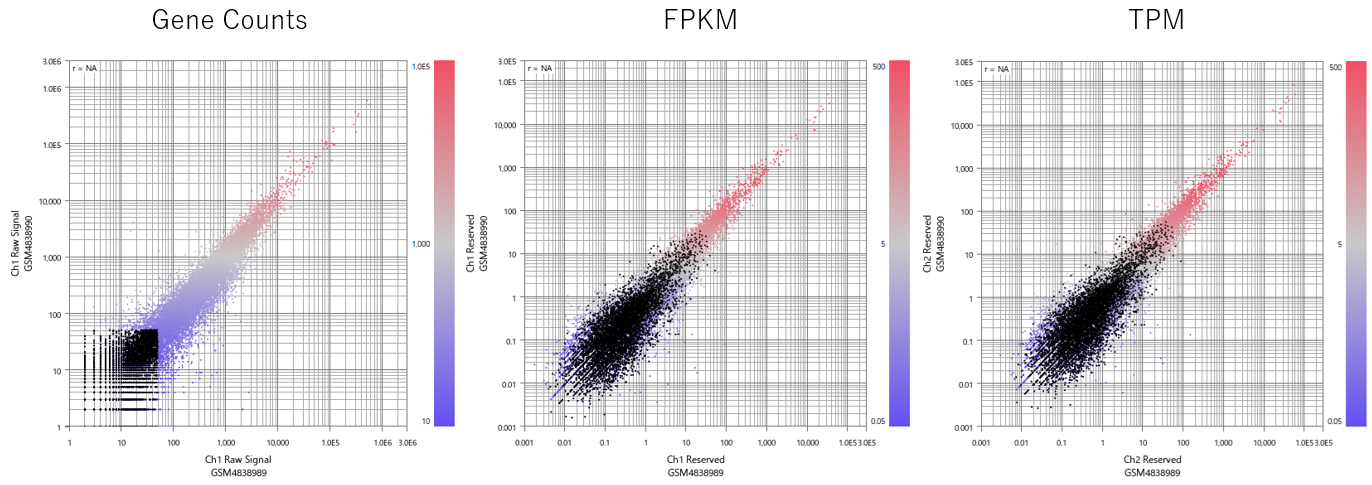
Fig3: Comparison of the same RNA-Seq dataset displayed as Gene Counts, FPKM, and TPM. Variability in the low-count region is easier to see with Gene Counts, whereas that instability becomes less apparent with FPKM and TPM.
Therefore, in RNA-Seq as well, data quality should not be judged only from the appearance of normalized values. It is important to examine the Gene Counts distribution, variability in the low-count region, and how the appearance of the data changes after normalization or correction. With Subio Platform , these different values and data distributions can be visualized so that the relationship between signal and noise can be understood and validated, helping you consider which range should be included in the analysis.
Summary
When evaluating the quality of gene expression data, relying only on correlation coefficients or visual neatness can be misleading. A high correlation coefficient indicates good reproducibility within the signal range, but correlation coefficients that include the noise region are also affected by how the data are represented and by the numerical processing algorithm.
Data in which noise is visible may appear to be of lower quality at first glance. However, visible noise makes it easier to judge the boundary between signal and noise. In that sense, there is value in being able to see noise as noise. Good gene expression data are not data that appear to contain